A crucial metric called Conversion Rate Optimisation (CRO) helps the best-performing marketing teams know how to get the most leads out of existing traffic.
A high conversion rate yields more leads, which means more revenue at lower acquisition costs.
As a startup, it’s typical to successfully convert a customer towards taking a series of desired actions: e.g. signing up for a free e-book, registering for a webinar, downloading a coupon, etc.
In CRO, conversion doesn’t necessarily mean a purchase. It is a data-driven process of turning customer interactions into meaningful ones. There are several key benefits:
Increased ROI & revenue
Better CX (customer experience)
Greater Competitiveness
Enhanced Understanding of Customers
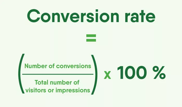
Calculating the Conversion Rate
To calculate the conversion rate for a particular website or marketing campaign, use below formula:
For example, if a website receives 100 visitors, and 5 of them sign up for a webinar, the conversion rate would be (5 registrants / 100 visitors) x 100% = 5%.
What is a Good Conversion?
A good conversion rate varies across industries, products or services offered, and other factors.
In e-commerce, a good one is generally above 2%. Depending on your target audience, industry, niche, traffic channels, and goals, a good conversion rate ranges from 1% to 4%.
Effective Call to Action (CTA) Buttons
The call-to-action (CTA) button is an important element of any website or marketing campaign, as it is the final step in the conversion process. CTAs like “Submit”, “Sign-up”, or “Register” are viewed as too direct, while more personalised CTAs like “Click to Get Your Gift” sound more inviting and can aid conversion.
Tip 1: FOMO
“The Fear of Missing Out” is a powerful tactic used to trigger fear in the minds of the audience. An example of FOMO at play is telling visitors your offer is exclusive for a specific time, prompting them to act immediately.
Tip 2: Colour Tricks
Colours influence how people perceive or interact with design elements. By creating different emotions, the right CTA button colour can communicate a desired action.
For example, using a bright, bold colour for a CTA button can grab the user’s attention and make the button stand out on the page, which can increase the likelihood that the user will click on it.
Efficy is a leading European Customer Relationship Management (CRM) solution that offers businesses of all sizes a complete, flexible, customizable, and scalable software platform. With products for marketing automation, sales, project management, customer service, and customer nurturing, Efficy provides a comprehensive solution to support business growth. Currently, the platform is used by over 300,000 users from 60 countries. Headquartered in Brussels and with more than 500 employees working in local offices across Europe and Hong Kong, Efficy’s mission is to help companies transform customer data into valuable insights while simplifying their employees’ work. Whether on-site or remote, Efficy is committed to contributing to the success of every company.